Maps of coronavirus infections have for months filled the front pages of newspapers and media websites, becoming a crucial way to visualize and understand the pandemic. These maps do not just convey information: they may be used as tools of persuasion, their disparate paths of the virus’s spread explained as reflecting the scenarios that politicians and commentators are charting, whether early comparisons to a bad flu season, catastrophic death predictions, conspiracies about COVID-19’s origins. Decisions as slight as whether to represent infections through color gradients or circular symbols, what shade of those colors, scale of those symbols, or geographic unit (such as dividing infections by county, city, or state) to use, can lead the public to draw different conclusions from similar data points. And the underlying data are human-generated as well, subject to flaws and omissions. “The same exact map with a headline that says, ‘Coronavirus flaring across the country’ or ‘Coronavirus a manageable problem,’ could be interpreted in two very different ways,” says Garrett Dash Nelson ’09, curator of the online exhibition “Bending Lines: Maps and Data from Distortion to Deception” hosted by the Boston Public Library’s Norman B. Leventhal Map & Education Center, which opened late last May. (It will remain on view until May 6, 2021.)
Maps are often viewed as objective representations, useful everyday tools to navigate the world. “It’s exactly that mundanity, their kind of seeming ordinariness, that makes maps so powerful,” Nelson says. “Because of the way they seem to show a reference point about the world, it’s easy to forget that even the most dull, statistical maps are themselves laden with assumptions about what to show or not to show, and how to show it.” “Bending Lines,” which includes dozens of maps, short essays, and interactive features spanning hundreds of years and the entire globe, reveals how cartography can be a technique of power—how maps do not merely reflect, but “bend” and even supersede, reality.
As an undergraduate, Nelson took courses in urban history, environmental history, and architecture before realizing that what he wanted was to concentrate in geography. Afterward, he earned two advanced degrees in the subject, a master’s from the University of Nottingham and a Ph.D. from the University of Madison-Wisconsin. “What I’m most interested in is the way people’s ideas about places shape the way they think and act,” he says.
When he joined the Leventhal Center as a curator about a year ago, its staff had already been considering an exhibition on “persuasive cartography”: maps designed to make an argument, like the one a British illustrator drew in the lead up to the Russo-Turkish War, depicting Russia as an octopus extending its tentacles into Asia Minor and Europe. “Bending Lines” takes the concept of persuasive cartography a step further, exploring how every geographical representation—not just those with an explicit agenda—constructs implicit arguments about what is true, about what people do or don’t need to see. In particular, Nelson wanted to focus on data: “We wanted to connect in the exhibition with an emerging agenda around data literacy and data justice,” he says, “thinking about the way information about the world shapes our ways of being in the world.”
The Leventhal Center originally planned for a show in its space at the library, which normally has 120,000 visitors per year. But when the pandemic closed public spaces across the country, staff pivoted toward a digital gallery experience. “We wanted to do that in a way that opened up some possibilities with data and interactivity,” Nelson explains. Virtual visitors, who can now come from around the world at any time of day or night, can try their hand at redrawing electoral districts or see whether they can judge a map’s trustworthiness.
Something, of course, is lost in the digital format—the scale and smell of an artifact, the ability to point and discuss with fellow museum-goers. “There’s something about seeing an actual old map that carries that aura of history, when you actually have that object in front of you,” says Connie Chin ’79, the Leventhal Center’s director. “On the flip side, one of the most powerful things on a high-resolution digitized map is zooming in,” which viewers can’t do through a glass display case. The biggest change may be how visitors navigate the show. “Usually when you design a physical exhibition, you think about flow and where you want the person to start,” Chin adds. “You don’t have to be linear when you look at this show, you can pop around and follow your own interests.”
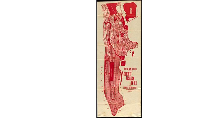
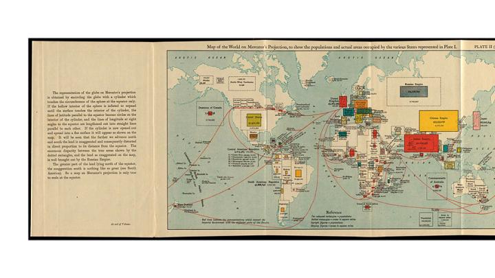
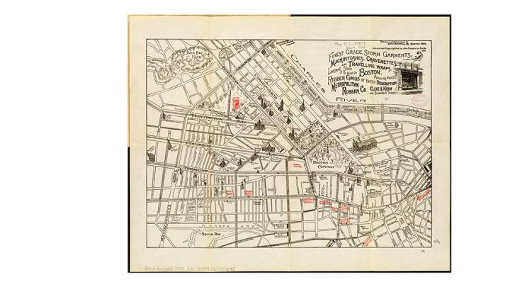
The exhibition is divided into three sections. The first examines some of the reasons people have made persuasive maps: to shape electoral outcomes through redistricting; to overstate the prominence of a railroad company’s routes by skewing geographic proportions; or to exaggerate national power. One nineteenth-century map of the British empire unrolled around the globe more than once, with the effect of depicting many of the largest colonies twice and doubling the empire’s perceived size.
Next, the exhibit examines techniques that cartographers use to change how viewers see the world, from changes in visual perspective to more subtle decisions about how data are depicted. Nelson asked cartographers to use a single data set and produce maps that told opposing narratives; one such pair explores hazardous waste sites in the state of Massachusetts. The first map, “Health Success,” shows that hazardous sites overlap with hospitals, indicating that the state is well-equipped to deal with health issues; the other, “Health Crisis,” shows how many hazardous sites are near towns with high poverty rates, which are more vulnerable to health complications. The contrast echoes recent debates over pandemic preparedness in the United States.
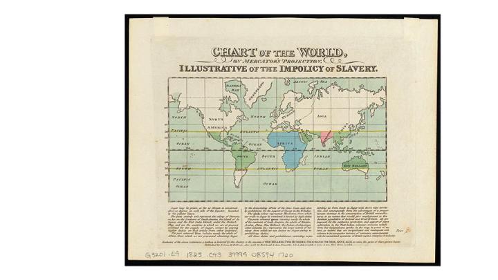
Finally, the exhibition tackles broader questions about belief and power. “We encourage visitors to think about maps not as either being true or false, perfectly objective or perfectly distorted, but instead to think about them as rhetorical objects that are connected to political power, social forms of trust, and thinking about the truth as something that is created,” Nelson explains. Many of the maps in this section, and throughout the exhibition, reflect the perspectives of powerful entities—governments, corporations, political parties—reflecting who has the power to bend the lines, as well as how institutions like libraries count what is and isn’t important.
For centuries, Nelson adds, that calculation has favored circulating and collecting the official publications of Western cartographers. He sought to correct for this bias and emphasize that a map’s power to bend reality can also be a tool to tell alternative stories and aid social struggle. One map of Cambridge, made in 2008 by a group of artists and activists that conducts participatory research to “temporarily transform public spaces dominated by corporate and political agendas,” hypothetically renames more than 330 streets, squares, and buildings, dropping the surnames of prominent white men in favor of monikers derived from idiosyncratic, lesser-known, or subversive subjects: Harvard Square is renamed “Crimes Against Humanity and Corporate Greed” and Massachusetts Avenue becomes “Prince Hall Boulevard,” after an important African American of the Revolutionary War period who spoke out against slavery and was a leader in Boston’s free black community.
Much of the exhibition resonates with current protests and unrest. There are maps that explicitly try to advance social justice, such as one from the civil-rights era that exposed and denounced segregation in Indianapolis. That maps have been, and continue to be, powerful tools to advance visions of an equitable society is no accident, Nelson says. “Maps will need to be part of a conversation about how to build a struggle that addresses many of the issues that have been at the center of these protests.” That involves “thinking about the maps that will be created not as static, neutral truth, but instead thinking about them as rhetorical weapons that are used in social struggles.”
